Four Horsmen Logo Design

Type: Logo Design
Client: Four Horsemen
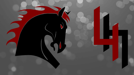
This logo was designed for the club ultimate team Four Horsemen out of Searcy, Arkansas. The Four Horsemen compete in the USA Ultimate Ozark Conference. They consistently find themselves in the top of their conference and needed a logo that matched their on the field prowess.
Since the name for the team was chosen from a passage in the biblical book of Revelation as a nod to the religious school in the town the team plays in, the colors that we picked were black and burgundy to represent fire and brimstone. Additional alternate colored horses of white, red and grey were designed for future jerseys as these are the colors of the Four Horsemen depicted in Revelation. The horse head logo that was developed elicits a strong, powerful horse that stomps opponents underfoot. With glowing eyes and fiery mane this stallion is not one to be trifled with.
The ambigram logo, which is used as a second logo for a the sleeve, reads the same upright or upside down. It conjures crispness and order to a game that sometimes appears chaotic on field.
